Description
About this item
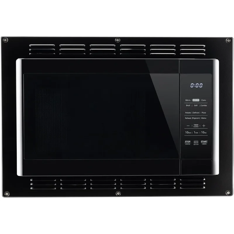
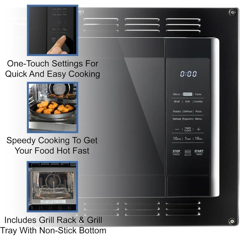
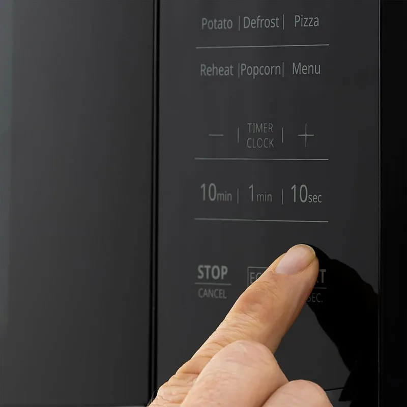
- Versatile Cooking Modes – From reheating to grilling, this air fryer and convection microwave has it all! With 6 different cooking modes including broil, combo cooking, air fryer, and more, you can cook anything from pizza to meat with ease.
- Convenient One-Touch Functions – No more guessing cooking times or temperatures. Our air fryer and convection microwave comes with one-touch programs for popular dishes like potatoes, pizza, popcorn, and more. Plus, its auto menu feature takes the guesswork out of cooking cakes, veggies, and beverages.
- Time-Saving Multi-Stage Cooking – Tired of constantly monitoring your microwave? Our product allows you to program multiple stages of cooking at once, so you can focus on other tasks while your food cooks perfectly.
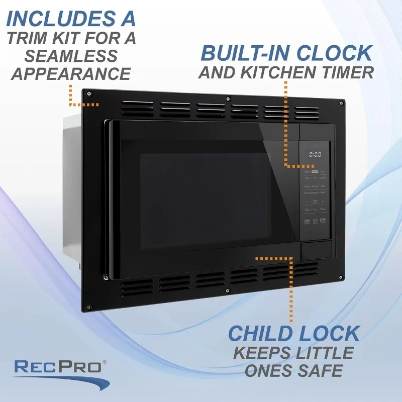
- Energy-Efficient And Safe – Our ECO mode that reduces power consumption during standby. Plus, the child lock feature ensures that little ones stay safe while in the kitchen.
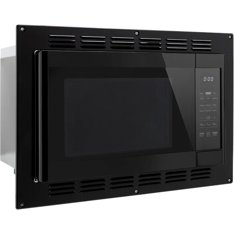
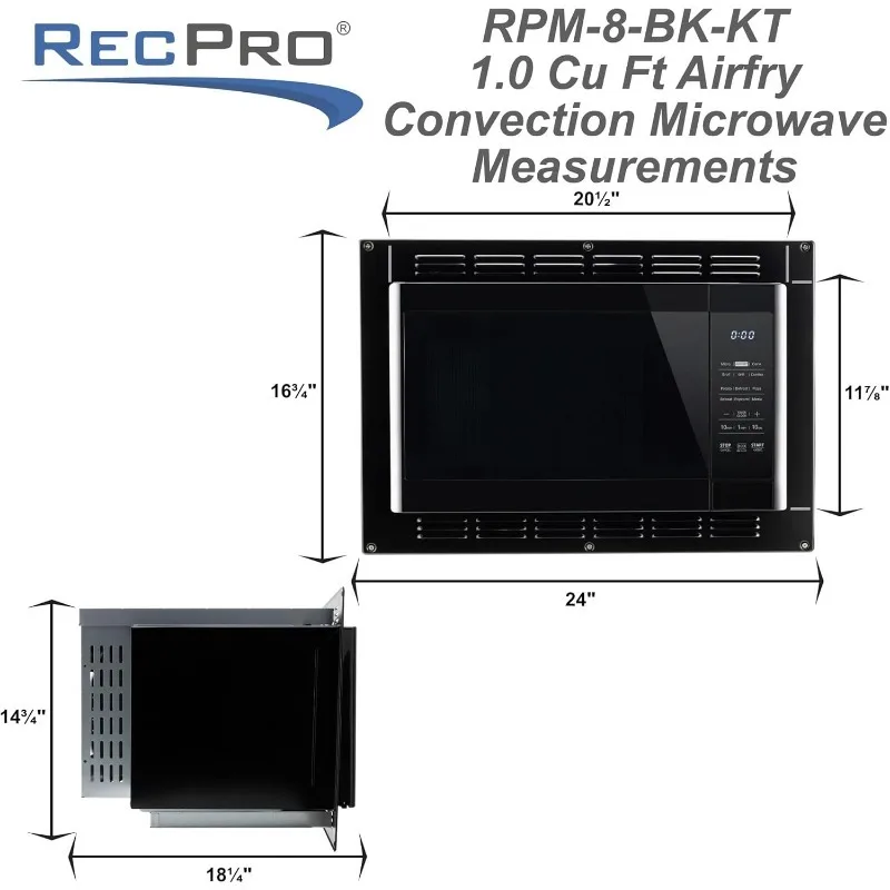
- Included Trim Kit For A Sleek Look – This microwave oven comes with a trim kit that seamlessly blends it into your kitchen decor. It also comes with all necessary accessories like a glass turntable and grill rack for convenient cooking.
")
")
")
")
")
")
.aplus-v2 .aplus-review-right-padding {
padding-right: 0.1rem;
}
.aplus-v2 .aplus-review-right-padding {
padding-right: 0.1rem;
}
.aplus-v2 .aplus-review-right-padding {
padding-right: 0.1rem;
}
.aplus-v2 .aplus-review-right-padding {
padding-right: 0.1rem;
}
.aplus-v2 .apm-brand-story-carousel-container {
position: relative;
}
.aplus-v2 .apm-brand-story-carousel-hero-container,
.aplus-v2 .apm-brand-story-carousel-hero-container > div {
position: absolute;
width: 100%;
}
/*
Ensuring the carousel takes only the space it needs.
The sizes need to be set again on the absolutely positioned elements so they can take up space.
*/
.aplus-v2 .apm-brand-story-carousel-container,
.aplus-v2 .apm-brand-story-carousel-hero-container {
height: 625px;
width: 100%;
max-width: 1464px;
margin-left: auto;
margin-right: auto;
overflow: hidden;
}
.aplus-v2 .apm-brand-story-carousel-hero-container,
.aplus-v2 .apm-brand-story-carousel-hero-container > div {
height: 625px;
}
.aplus-v2 .apm-brand-story-carousel.a-carousel-container {
padding: 0px;
}
/*
This centers the carousel vertically on top of the hero image container and after the logo area (125px).
Margin-top = (heroHeight – cardHeight – logoAreaHeight) / 2 + logoAreaHeight
*/
.aplus-v2 .apm-brand-story-carousel .a-carousel-row-inner {
margin-top: 149px;
}
/*
Cards need to have a width set, otherwise they default to 50px or so.
All cards must have the same width. The carousel will resize itself so all cards take the width of the largest card.
The left margin is for leaving a space between each card.
*/
.aplus-v2 .apm-brand-story-carousel .a-carousel-card {
width: 362px;
margin-left: 30px !important;
}
/* styling the navigation buttons so they are taller, flush with the sides, and have a clean white background */
.aplus-v2 .apm-brand-story-carousel .a-carousel-col.a-carousel-left,
.aplus-v2 .apm-brand-story-carousel .a-carousel-col.a-carousel-right {
padding: 0px;
}
.aplus-v2 .apm-brand-story-carousel .a-carousel-col.a-carousel-left .a-button-image,
.aplus-v2 .apm-brand-story-carousel .a-carousel-col.a-carousel-right .a-button-image {
border: none;
margin: 0px;
}
.aplus-v2 .apm-brand-story-carousel .a-carousel-col.a-carousel-left .a-button-image .a-button-inner,
.aplus-v2 .apm-brand-story-carousel .a-carousel-col.a-carousel-right .a-button-image .a-button-inner {
background: #fff;
padding: 20px 6px;
}
.aplus-v2 .apm-brand-story-carousel .a-carousel-col.a-carousel-left .a-button-image .a-button-inner {
border-radius: 0px 4px 4px 0px;
}
.aplus-v2 .apm-brand-story-carousel .a-carousel-col.a-carousel-right .a-button-image .a-button-inner {
border-radius: 4px 0px 0px 4px;
}


Reviews
There are no reviews yet.